

WHo AM i
Hi! I'm Glenna Xie. I currently work for the everything store that globally revolutionized online shopping experience and transformed the concept of retail. You may know it as Amazon.com. I am a design geek 💻, a productivity nerd ✍️, and a fitness fanatic 🏃♀️.
You can also find me on Medium.
Download Resume Email Meinvolvement
learning
Product School (Denver)
Graduated from University of Denver
GPA: 3.9
Graduated from University of Colorado Boulder
Minor in Technology, Arts & Media (TAM)
GPA: 3.8
passion
8 Years
8 Years
6 Years
Hard Skills
YouTube Project
One of the best things that happened to me at Amazon, is meeting my mentor, Jon. We clicked so much on so many topics, and we never get tired of talking (and goofing around)! We decided to take it to Youtube right before the pandemic hit the US. This is the first of (hopefully) many future episodes of, well, just two like-minded designers chatting.
Mobile vs Desktop
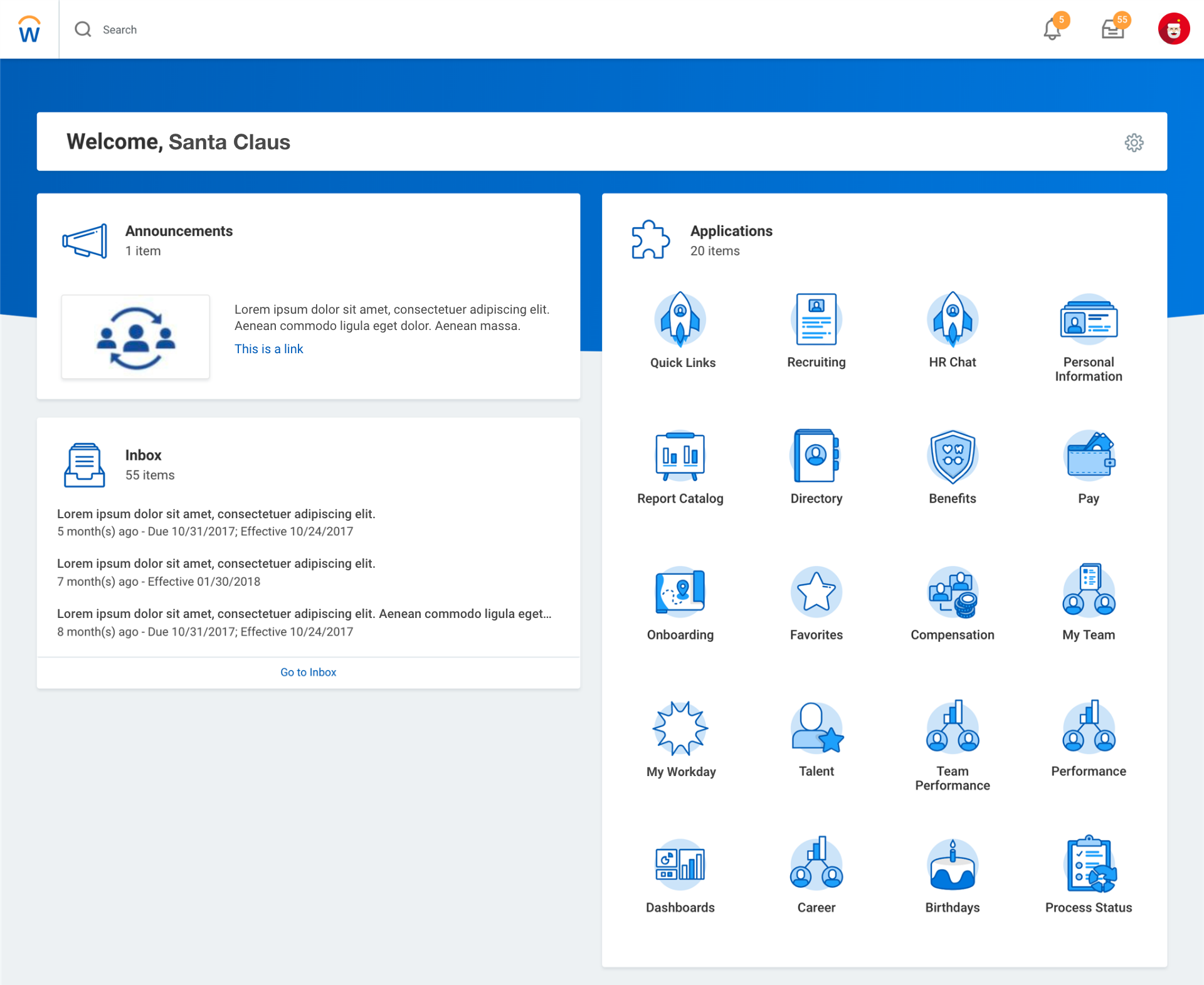
According to an interview with the VP of User Experience at Workday, a few years ago they adopted the mobile first approach as their responsive design strategy. Mobile first means that the entire design process starts with a smaller device, usually an iPhone or an iPad, and start designing by trimming down content to its most vital elements, due to the constraints of the screen space. Instagram is a great example of this. The opposite of this approach is desktop first. I generated this hypothesis that desktop first approach is better suited for Workday’s HCM products based on quantitative and qualitative research that I conducted.
According to an article published on Medium, mobile first design is a good choice if:
Desktop first design is a good choice if:
According to the The Sierra-Cedar 2018–2019 HR Systems Survey White Paper, the latest research installment of the longest running, most widely distributed, and most highly participative research effort in the HR industry, the mobile adoption rate of HR applications currently is 50% among large-sized enterprises, and 53% among medium-sized enterprises. However, the adoption rate in different product area shows:
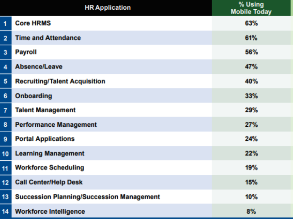
This set of result tells us that the product areas that Workday focuses the most - Recruiting, Onboarding, Talent Management, Performance Management, Learning Management are still at a relatively low adoption rate.
We can conclude that Workday’s HCM system has much higher number of users on the desktop, it is a office/business tool that has rich features, and the user experience could be merely functional on mobile, because the expectation is that workers generally use HR applications in an office setting, where they usually have access to a computer.
I also validated this hypothesis through an interview with an mid-level manager at a Fortune 500 company that adopted Workday as their HCM solution.
Q: “What do you use Workday HCM application mostly for?”
A: “I use it mostly for managing my employee’s mid-year performance review and end-of-the-year performance review, recruiting talent and completing management training materials.”
Q: “Do you have Workday’s mobile app downloaded on your phone?”
A: “They have an app? I didn’t even know about it.”
Q: “Have you ever tried to access workday on any devices other than your laptop?”
A: “No. I have to log into VPN to be able to use Workday. My phone doesn’t have VPN software installed.”
Q: “Have you ever used Workday outside your normal work hours?”
A: “Extremely rare. Maybe once in the past year.”
Q: “How do you like Workday’s design on your laptop?”
A: “I like that the design is clean. It’s a much friendlier design than some of the older HR software. However, it seems like it could be more efficient. Sometimes it takes way too many clicks to get to where I want to be. There are a lot of features and functionalities in Workday, I only use a few of them and wish they could be more easily accessible.”
Web Application

It is no secret that enterprise application is complex, not to the mention that the business model itself is even more convoluted. During this project, one of the biggest challenges for me was to work with the business to understand and clarify requirements filled with jargons and industry specific concepts. In order to empathize with the users and map user flows, I knew I needed to first and foremost become knowledgeable of the business.
I listen to and talk with people. Constantly. I made eight business trips to our branch offices in one year to meet with people of different roles and responsibilities. I am on the phone with the users every day since the beginning of the project. I spend time building relationships with the users because I believe the more I understand the day-to-day operations of our business, the more product issues I’ll be able to uncover.
For the past three years, the company’s sales volume has tripled and the number of employees has doubled. It went from a start-up sized organization to the biggest private finance company in the sector. Having a flexible and scalable system is the key to adapting new business opportunities and onboarding new employees. Building a system that scales is not as easy as it sounds, and it requires tight collaborations between product management, design and development.
Because I was a full-time software developer before transitioning to a more design focused role, collaborating with the engineering team comes natural for me. In fact, I designed and coded the UI framework for this project and am still writing code on a daily basis. I collaborate with other front-end developers and participate in back-end database schema discussions, for the purpose of understanding technical constraints and adjusting design decisions accordingly.
I have to admit that enterprise CRM isn’t exactly a designer’s dream project. Most people think it’s about boring numbers and spreadsheets and doesn’t excite the audience like consumer-facing products do. However, that doesn’t give us designers excuses for producing low-quality, unusable products. To me it’s a very interesting challenge. How do I design a clean, elegant, exciting enterprise CRM, something people would not expect? Can we make the users’ jobs less tedious by presenting them with a user-friendly, intuitive, even fun product?
The old CRM the company used was jammed with data points and tables produced with no thought-out design decisions whatsoever. The worst part is that people got used to it and because they had no other choices but to use the software in order to complete their tasks, their feedback was never asked or heard. After talking to the users, I made the decision to completely revamp the design system for the purpose of giving the product a modern look-and-feel, and improving the user experience by establishing consistent design components.
Customer data is all over the place. Different departments have different views of the customer and don’t know what’s happening on the other side.
Centralized customer database along with holistic view of the customer relationship shared between all departments. This is the heart and soul of the system. Being able to view all histories on a given customer gives customer service, marketing and sales incredible power to retain existing customers and attract new ones.
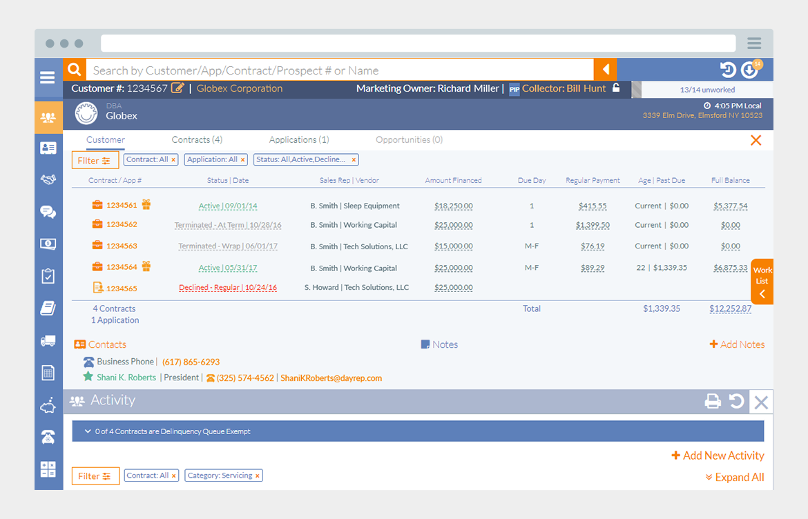
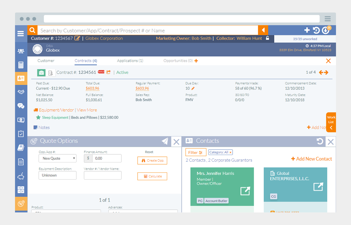
Many available tools in the system but can only use one tool at a time.
To solve this problem, I wanted to first understand why the users felt the need to look at two tools at the same time, i.e., what kind of information they were specifically looking for. What I found during observations was the main reason was not that they needed to look at multiple sources of information, because there is only so much a person can process at a time. The true reasons were:
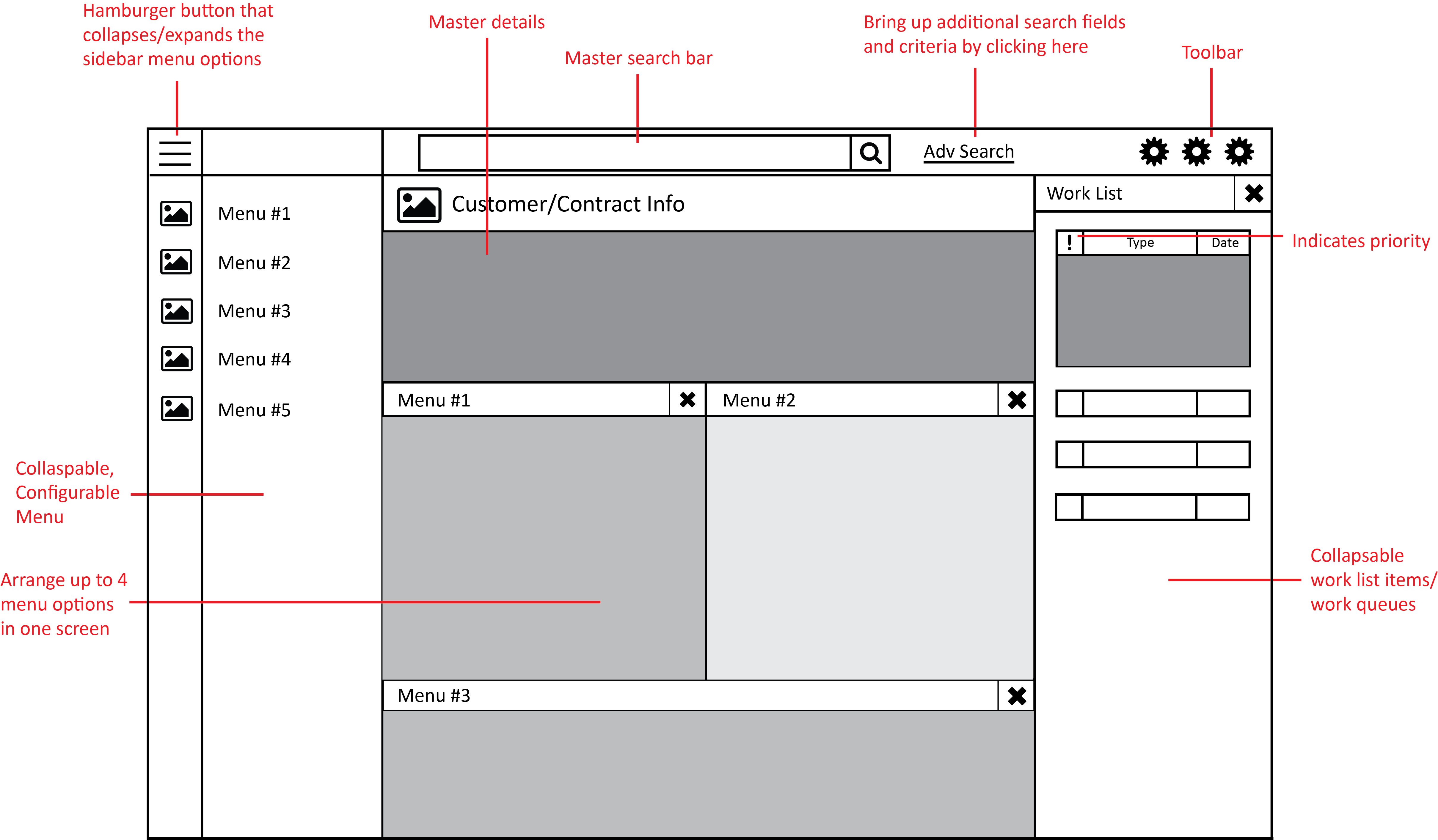
With these considerations in mind, I came up with a design that allows two tools to be open side by side.
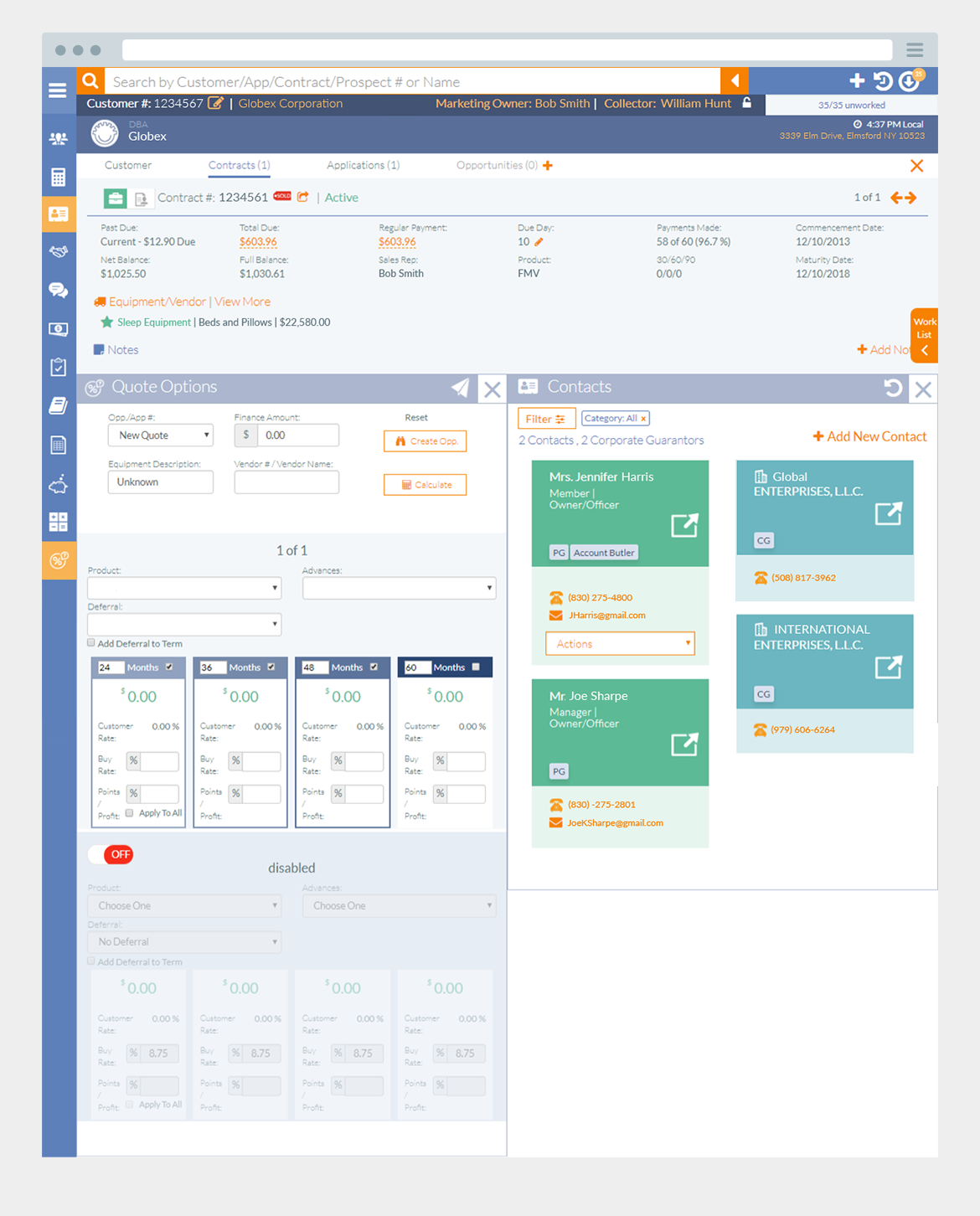
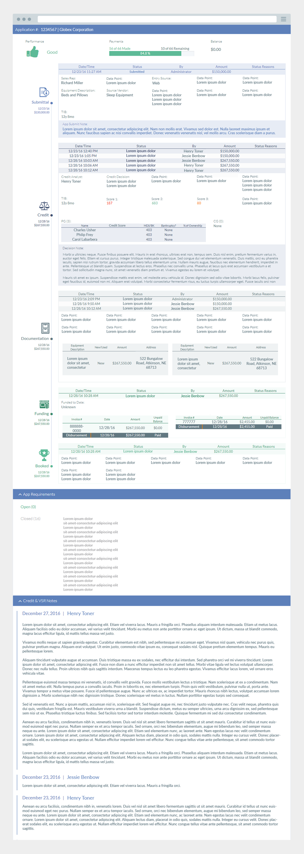
Unable to view detailed histories on a given application. When a customer has specific questions about their application, employees are not sure where to look.
In the old system, we did store detailed data about a customer’s application so the problem wasn’t exactly that they were unavailable. The problem was that they were all over the place and not labeled properly. Some senior employees knew where they were and what they meant, but because the knowledge transfer took so long, I found that new employees were inevitably confused.
To solve this problem, I started off by gathering all the data points the users would like to see and then organized them based on different stages of an application.
Sometime it doesn’t matter how bad a product is, power users will find themselves a way to make it usable. However, when I show them the possibilities to make the product better and the fact that they don’t necessarily have to suffer, they get more excited than anyone else.
Designing enterprise software for a finance company tells me that sometimes the actual design work is the easiest part of the whole product cycle. The harder part is empathizing with the users and accomplishing business goals at the same time.
Design is a language. It shows everyone a vision of what can be done. My favorite moment is when the user says, “Yes! This makes so much more sense now!”
There is always room for improvement. The important lesson is about having a humble attitude and keep learning.